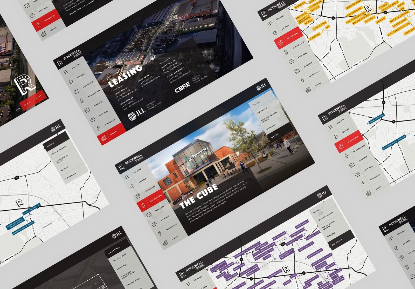
Rockwell Park is a mixed-use redevelopment outside Pittsburgh, where the development team took an existing community and rebuilt it around modern infrastructure, forward-looking amenities, and neighbourhood retail - the sort of project that is hard to sell from a floor plan because the pitch is the place, not the square footage.
JLL and the ownership group wanted an on-site marketing tool for exactly that problem: something a broker could stand at with a prospective tenant and walk them through the property before and after a physical tour. A slide deck is linear and a printed site plan is static. Neither survives contact with the question "what's over there?"
The obvious build for a touchscreen kiosk is a native application. We went the other way and built it as a web application, and that single decision determined most of what made the tool good.
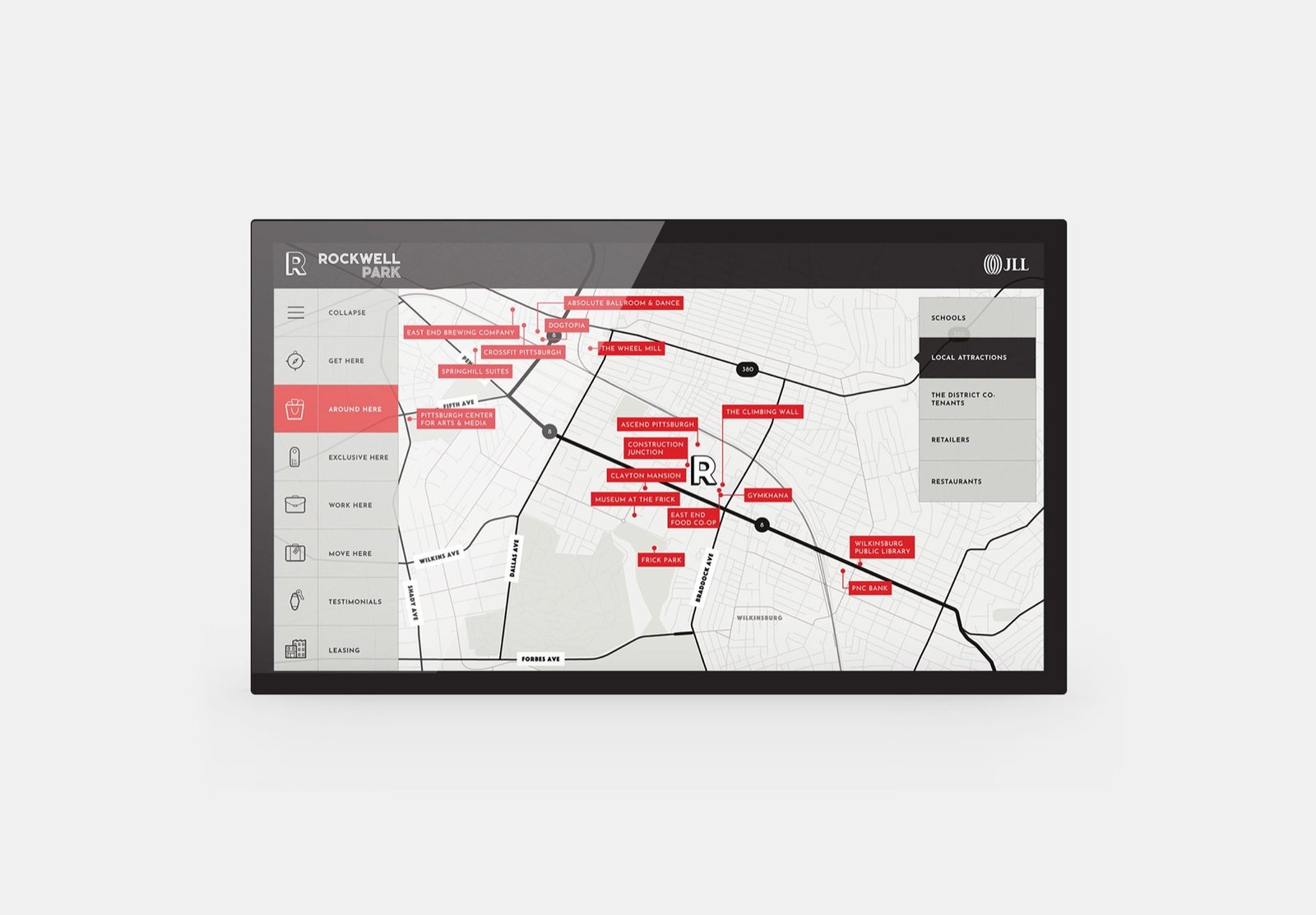
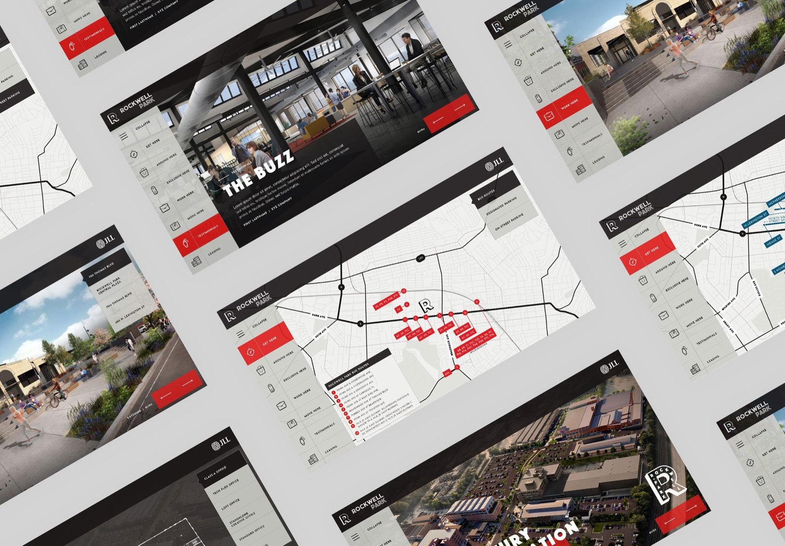
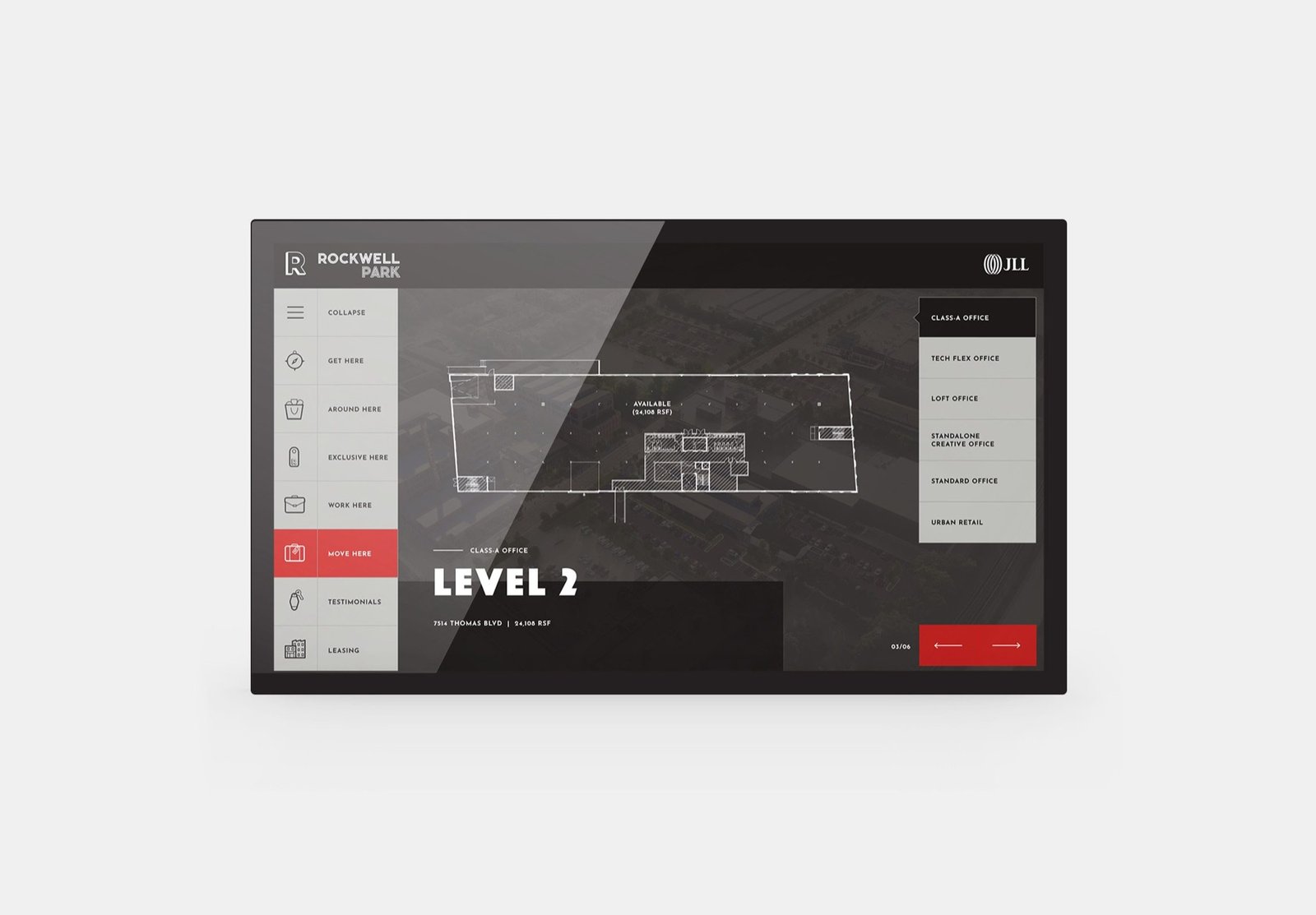
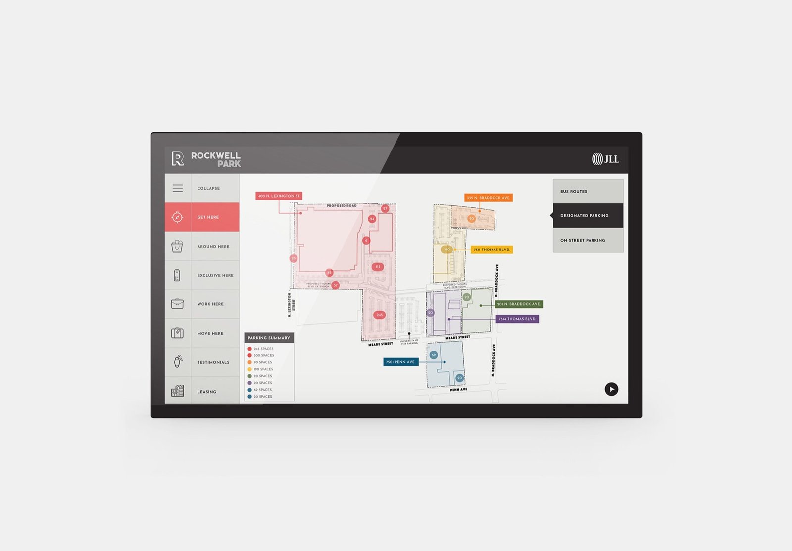
The engagement also carried a brief to raise the project's digital brand. A leasing tool is a brand surface whether anyone plans it that way or not - it is often the first sustained interaction a tenant has with the property, and it sits between two very expensive things: the building and the decision.
So the interface was designed to feel like the development rather than like software: confident type, strong photography, a restrained palette with one hot accent, and motion that reads as considered rather than showy. The tool had to be worth standing in front of.
The leasing team got a sales tool that survives a real conversation - one that follows the tenant's questions instead of a script, and that stays accurate because updating it takes a browser rather than a developer.
It is also the clearest early example of a pattern that runs through everything I have built since: put the boring, repetitive part of the job behind an interface the people doing that job can operate, and the tool stops decaying the day it launches.