Reliance Orthodontic Products has made bonding adhesives for orthodontic work since 1981, and holds an enviable position: category-leading market share, a reputation for consistency, and prices well under the competition. Every product is clinically field-tested for two years before it goes on sale. This is a company that earns trust slowly and on purpose.
The engagement started as a single new-product branding job. Looking at how that product would reach a shelf surfaced the real problem: with well over 500 SKUs, packaging had accreted over four decades rather than been designed. Each new product meant reinventing a layout, and the cumulative drift meant the range no longer looked like one company's shelf.
They did not need a designer to make 500 packages. They needed a system their own staff could use to make the 501st correctly, without calling anyone.
We evaluated and rebuilt the entire packaging architecture as a rules-based system rather than a set of finished artworks. Product families get consistent colour coding and hierarchy; label formats are templated against real substrate and dieline constraints; the placement of regulatory and instructional content is fixed rather than negotiated per product.
The test I applied throughout: could someone on their team onboard a new adhesive and produce correct, on-brand packaging without a design decision being made? Where the answer was no, the system was still underspecified.
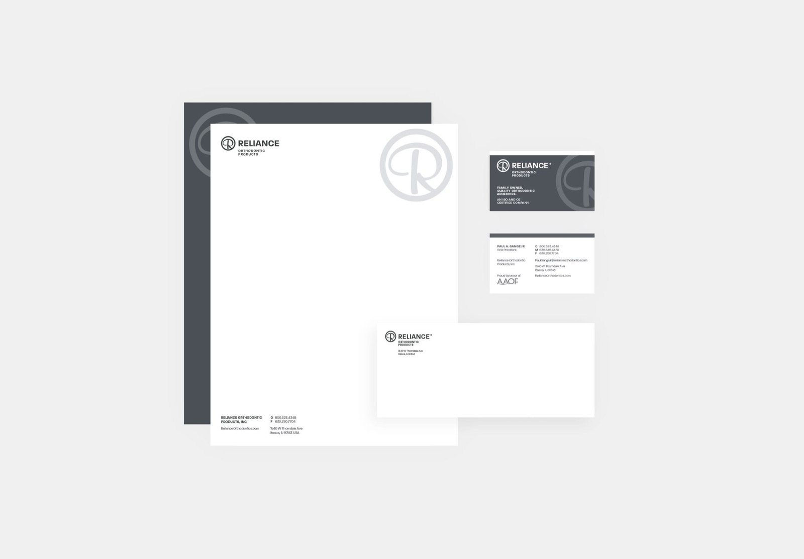
The identity work followed the same logic. Rather than a rebrand, this was a logo and brand update - the mark carries four decades of recognition among orthodontists, and throwing that away would have cost far more than any visual gain. The refreshed identity then rolled out across everything customers and staff touch.

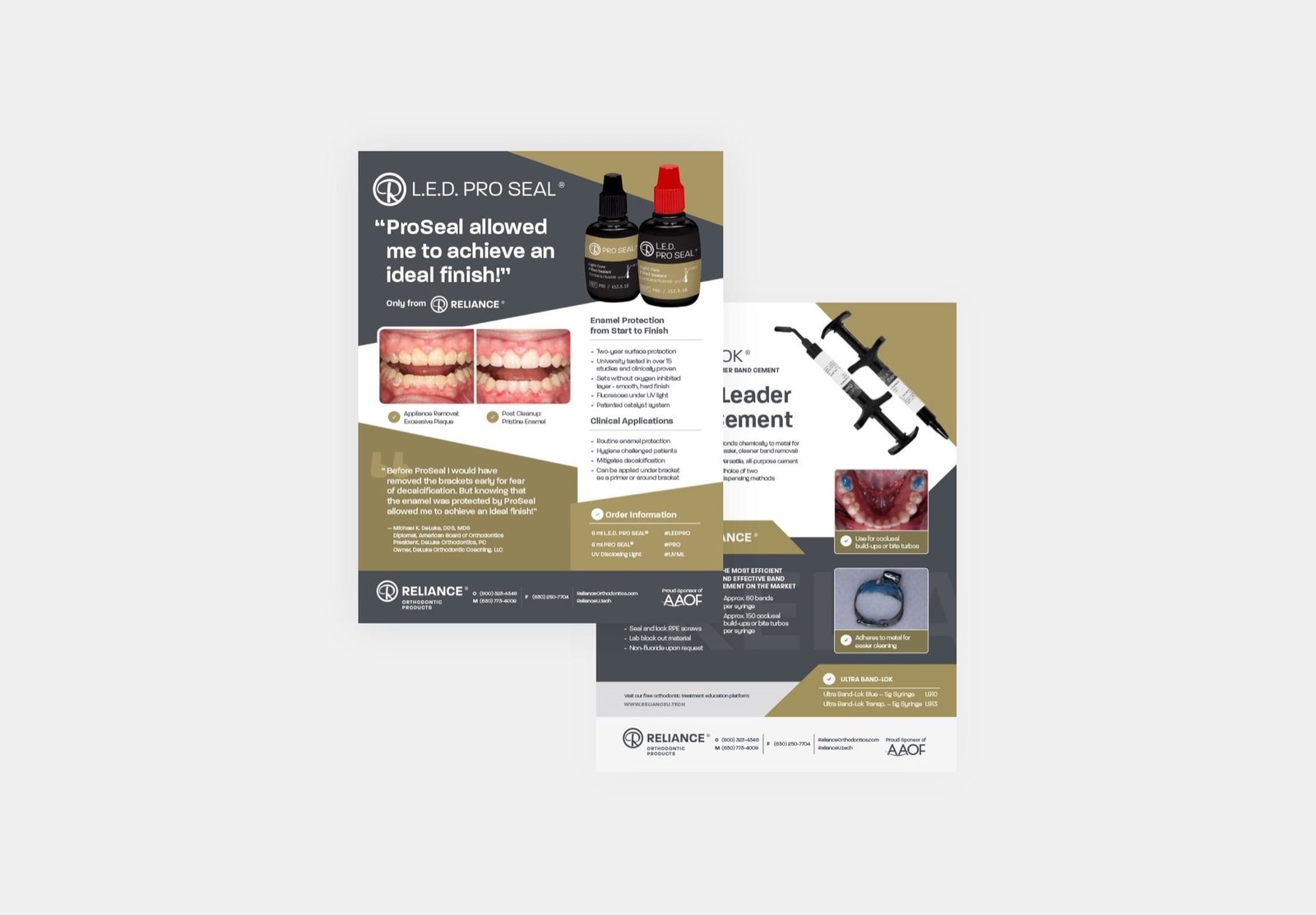
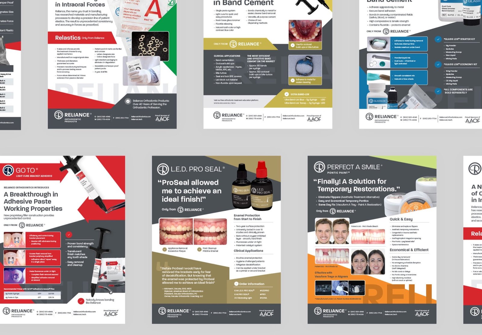
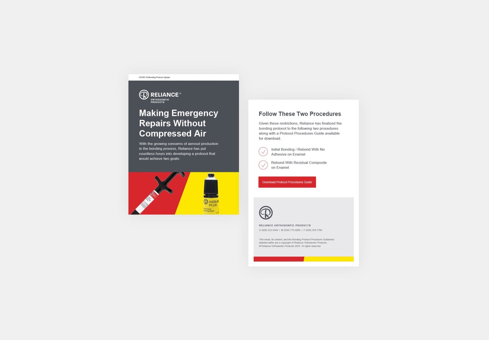
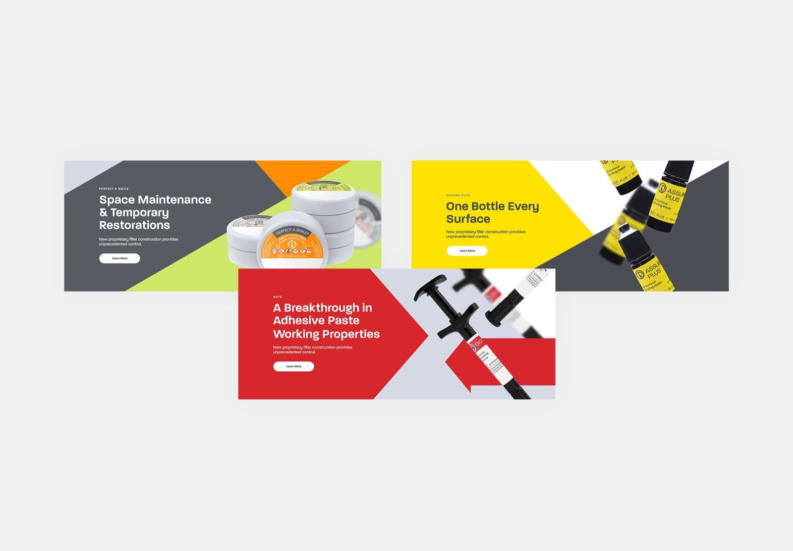
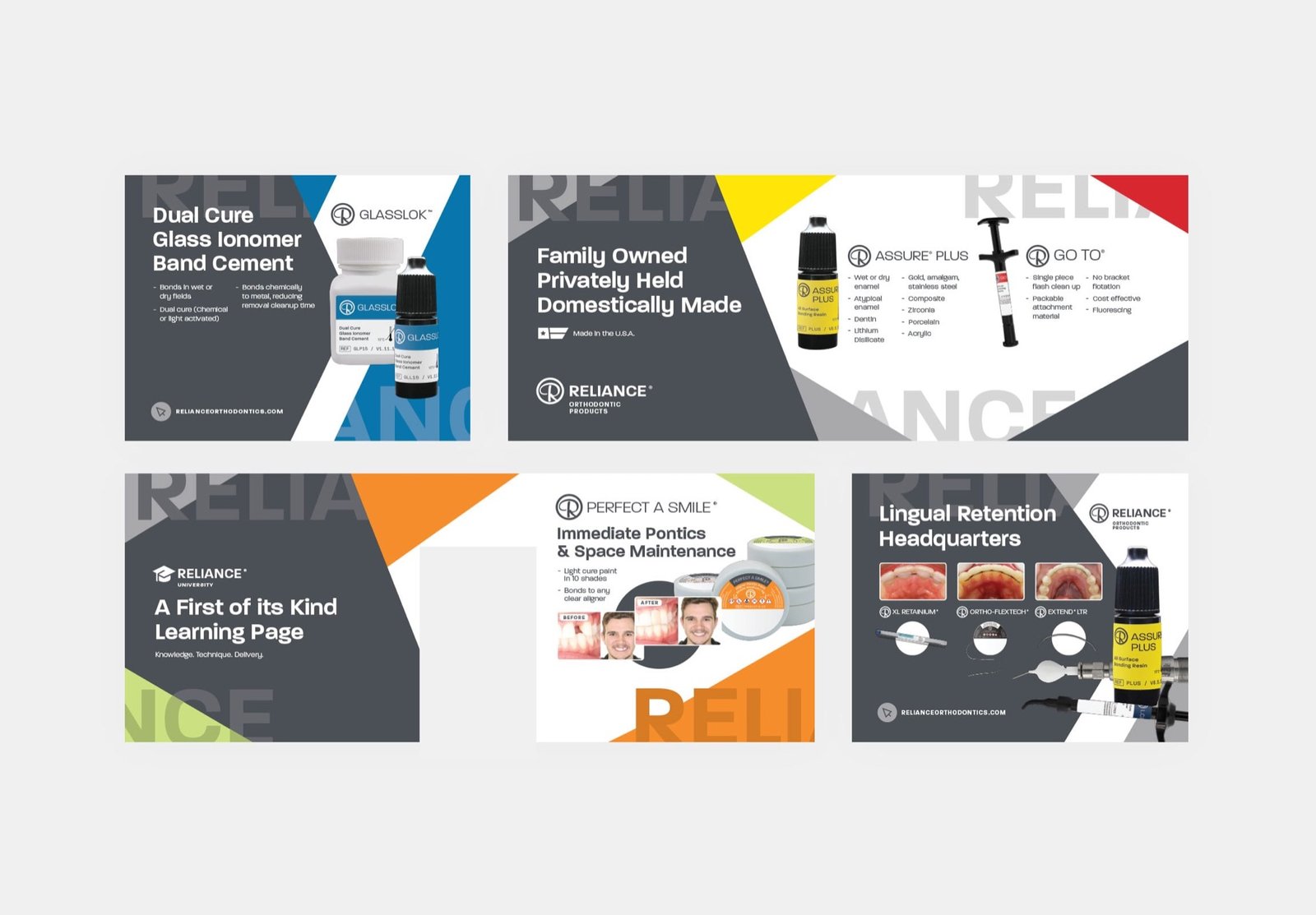
Packaging was the spine, but a medical products manufacturer touches its market in a lot of places. The system extended into trade show booth design, a redesigned print collateral library, digital and print advertising, training presentations for internal staff, and an IFU programme - instructions for use - built to be better than the industry norm.
IFUs are the least glamorous document in medtech and one of the most consequential. They are regulatory artefacts, but they are also the thing a clinician reads while holding a product for the first time. Treating them as a designed, systematised deliverable rather than a compliance chore was one of the more satisfying parts of the engagement.
The range reads as one company again, and adding a product no longer requires a design engagement - the staff build it from the system. For a manufacturer whose competitive edge is operational efficiency, that is the outcome that compounds.
It is also the earliest version of an argument I have made on every project since: shipping a system that other people can operate beats shipping a beautiful artefact they have to come back to you for. The same instinct produced an email component library at MasterClass and an agent that builds against it.